This is my last post (unless I discover some other awesome designs I've done in the past) on my Dinosawus blog.
My time with Dinosawus came to an end since I had to move away. But it was one of the biggest projects I've ever had to work on, and had such a blast with the team.
I am currently working as a freelance illustrator taking on various projects such as music videos, comic books, colour scheme designs, storyboarding, poster, postcard and other designs.
I wish the team the best of luck. This is Anna, signing off.
Ttttsssssschhhhhhh....
Thursday, March 10, 2011
Wednesday, January 12, 2011
Christmas Card Animation
Custard Square asked me to create an animated greeting card using cute dinosaur characters. And of course, I said 'yes'. Before I go on, here is the final animation:
The following are some dino-suit concepts.
 |
| Concept Sheet #1 |
 |
| Concept Sheet #2 |
There were a lot of discussions over what the dinosaur suits should look like. Whether they should have teeth or not because clearly the teeth were too sharp and it looked like the human was being digested...etc. But we came to an agreement once I produced enough designs. I promise you, it wasn't because I was beating them with my nunchucks.
There was a lot of choreography involved also (and lucky for you, the films of myself dancing like a drunk clown have been erased). And after that were samples of the dancing dinos. Here's a couple:
And finally the stage design. So very easy to do in Illustrator. Not so much in Flash. There were a lot of graphics being imported and exported repeatedly between the two software. Flash is NOT kind to drop shadows. Nevertheless I got there in the end, and here is another work in progress image in the template.
Like any other animation, it was lot of hard work (the whole thing had to be done within a month). But even after watching this video 5 billion times, it still makes me laugh, so I am happy I got to work on it.
Tuesday, January 11, 2011
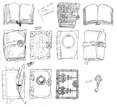
Handbook Concepts
Here are some old concept drawings I did of handbooks that was initially going to be for the Adventures.
From what I remember I think the pop-ups and dialogue boxes in Adventures just got too cluttered. So we ended up settling for scrolls instead.Monday, January 10, 2011
My Stuff - Updates
Yay! Updates and added STUFF! (old version)
Since we've added more items to shop, it was time to add more categories to this interface design.
We are very happy to announce our new items Vehicles and Pets!
Also added is the new pop-up message for when the player doesn't have enough credit for the desired item.
The icon designs are always such a challenge because of the size and the simplicity I need to consider. But these were straight forward enough, that it didn't take as much time as most other edits. - WHEW!
Wednesday, December 22, 2010
Shout-outs Galore
Here are a very small handful of shout-out pages I designed. The colour design to make things more child-friendly is always a challenge since I don't ever want to recycle through what I have already used (and kids would totally pick that out). It is all about originality!
Tuesday, December 21, 2010
Updated Scenes
There are updates of the old scenes as well as the introduction of new scenes, so I hereby dedicate this post to all of the updated + new scenes.
 |
| Bridge Crossing with a few added games |
 |
| Interior of Last Cafe - a few things tweaked and removed |
 |
| Interior of the Museum - added extras and new buttons |
 |
| Interior of Club House with a few new games and a few old games removed |
 |
| Dino Town - Central district for announcements and news |
 |
| Interior of the Diner - added game of the Rock Band and a few tweaks of other buttons |
 |
| Dino Mart is where we sell everything. This place is constantly updated |
 |
| M.O.T - A new vehicle town for both boys and girls. |
 |
| Level 1 of M.O.T is now full of car games (woohoo!). |
 |
| Level 2 of M.O.T now has direct shortcuts to buy new vehicles! |
 |
| Pet Zoo - also a new scene to enquire about our new products "pets" |
Wednesday, December 1, 2010
Front Page Website
I was asked to design a front page for the Dinosawus website. The expansion of the virtual world wasn't quite portrayed by our old design. Here are some concepts.
And the final - with the help of our design employees (Frederick and Zcarina), we were able to speed up and finish the swf animation for our website. Hurray!
Subscribe to:
Comments (Atom)


